1. Is the topic legible? Yes 2. Is the overall design expressive? Yes 3. Is the image dominant in the design composition? Yes 4. Is the hero image expressing a definite personality. Yes 5. Is the typography expressive? 6. Is the item creative? Yes but can be more bold. Concept is good but not well executed. 7. Is it a balance of both logic and intuition (magic? ) Both. But creativity lacks aesthetic appeal. 8. Does rationale successfully explain the design solution? Sorta. Crudeness is not well expressed though. 9. Weakness: Need more distinctive materials, a more expressive mask, using different types of material and placement to enhance the features of the mask. Even in an attempt to minimize the number of colours used, contours of the mask should still be emphasized by using more types of material (even if they represent crudeness/rough/manly/barbaric). Eg a series of black material: black lipstick, arylic. The mask lacks excitement / WOW factor. A elegant mask can be pink and silky. A grand mask can be black with feathers and golden or purple trimmings. A sluty mask can be crimson red with velvet fabric. A strong yet artsy mask must speak for itself thru the choice of material n colour. Nails? Hammer? Rust? Metal? Piercing? Something. Gives it more PERSONALITY. Maybe try to make it more 3D? it seems too flat. Mask size too big. Back: poor splash. Colour arrangement needs to improve on. Rainbow colours can be very nicely blend. The blend behind is chaotic and gives headache. Together with the front, its just creates a Messy overall. If the front mask has very obvious personality, you may want to go easy on the back. If front is bold, the back can be more simplistic. Emphasis should be on the front and the back, should be information. Though you want to create dual use, it maybe too ambitious as you have to give sponsor sufficient “recognition”.
hi there im sorry i didnt reply to this sooner. thanks for the comments! appreciate it. i agree the mask is too flat, and a lot of your suggestions are really interesting and exciting and i haven't thought about them! i think i was too constrained by brief in that i thought it was to be a 2 sided printed item, but yeah i could have made it more 3D. Great! I could really do loads with this. Cheers!
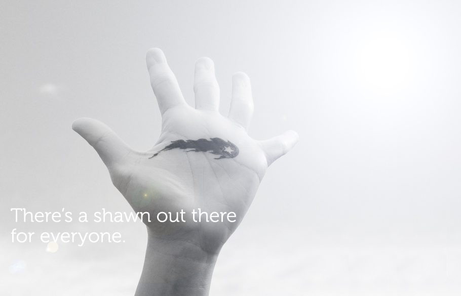

1. Is the topic legible? Yes
ReplyDelete2. Is the overall design expressive? Yes
3. Is the image dominant in the design composition? Yes
4. Is the hero image expressing a definite personality. Yes
5. Is the typography expressive?
6. Is the item creative? Yes but can be more bold. Concept is good but not well executed.
7. Is it a balance of both logic and intuition (magic? ) Both. But creativity lacks aesthetic appeal.
8. Does rationale successfully explain the design solution? Sorta. Crudeness is not well expressed though.
9. Weakness: Need more distinctive materials, a more expressive mask, using different types of material and placement to enhance the features of the mask. Even in an attempt to minimize the number of colours used, contours of the mask should still be emphasized by using more types of material (even if they represent crudeness/rough/manly/barbaric). Eg a series of black material: black lipstick, arylic. The mask lacks excitement / WOW factor. A elegant mask can be pink and silky. A grand mask can be black with feathers and golden or purple trimmings. A sluty mask can be crimson red with velvet fabric. A strong yet artsy mask must speak for itself thru the choice of material n colour. Nails? Hammer? Rust? Metal? Piercing? Something. Gives it more PERSONALITY. Maybe try to make it more 3D? it seems too flat. Mask size too big.
Back: poor splash. Colour arrangement needs to improve on. Rainbow colours can be very nicely blend. The blend behind is chaotic and gives headache. Together with the front, its just creates a Messy overall. If the front mask has very obvious personality, you may want to go easy on the back. If front is bold, the back can be more simplistic. Emphasis should be on the front and the back, should be information. Though you want to create dual use, it maybe too ambitious as you have to give sponsor sufficient “recognition”.
anony
hi there im sorry i didnt reply to this sooner. thanks for the comments! appreciate it. i agree the mask is too flat, and a lot of your suggestions are really interesting and exciting and i haven't thought about them! i think i was too constrained by brief in that i thought it was to be a 2 sided printed item, but yeah i could have made it more 3D.
ReplyDeleteGreat! I could really do loads with this.
Cheers!