

It seems Melbourne City's getting an upgrade in the form of a new logo.
Or what counts as an upgrade it seems.
$25, 000 spent on a new logo design that looks like something a prep school student could do on MS Paint. The new logo has drawn lots of flak regarding its representation of the city's vibrant and creative vibes. Many commenting that it is merely a "cut-and-paste" design of Federation Square.
Residents of the city of Monash are crying foul too, stating that the new logo is much too similar to theirs - that of a big "M", of which they have been using since 1995, and actually stood for something.
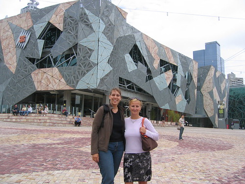
Compare the logos above, the top being the previous logo and the 2nd being the "upgrade". Now, look at the 3rd picture (Federation Square) and tell me you don't agree it's a rip off. Then have a look at the last picture, which is the logo of Monash. Appalled yet?
*Pictures do not enlarge*
You can read more of the article at this link.
Whether or not it is worth the taxpayer's money, you be the judge.
No comments:
Post a Comment